Control charts are used for statistical analysis to determine if a process is in a stable state of control. Control charts are very similar to run charts, except that control charts have additional lines for upper and lower control limits. Control charts help us to determine the effectiveness of our quality control over time and view irregularities in order to improve our control quality. Examine the control chart below: 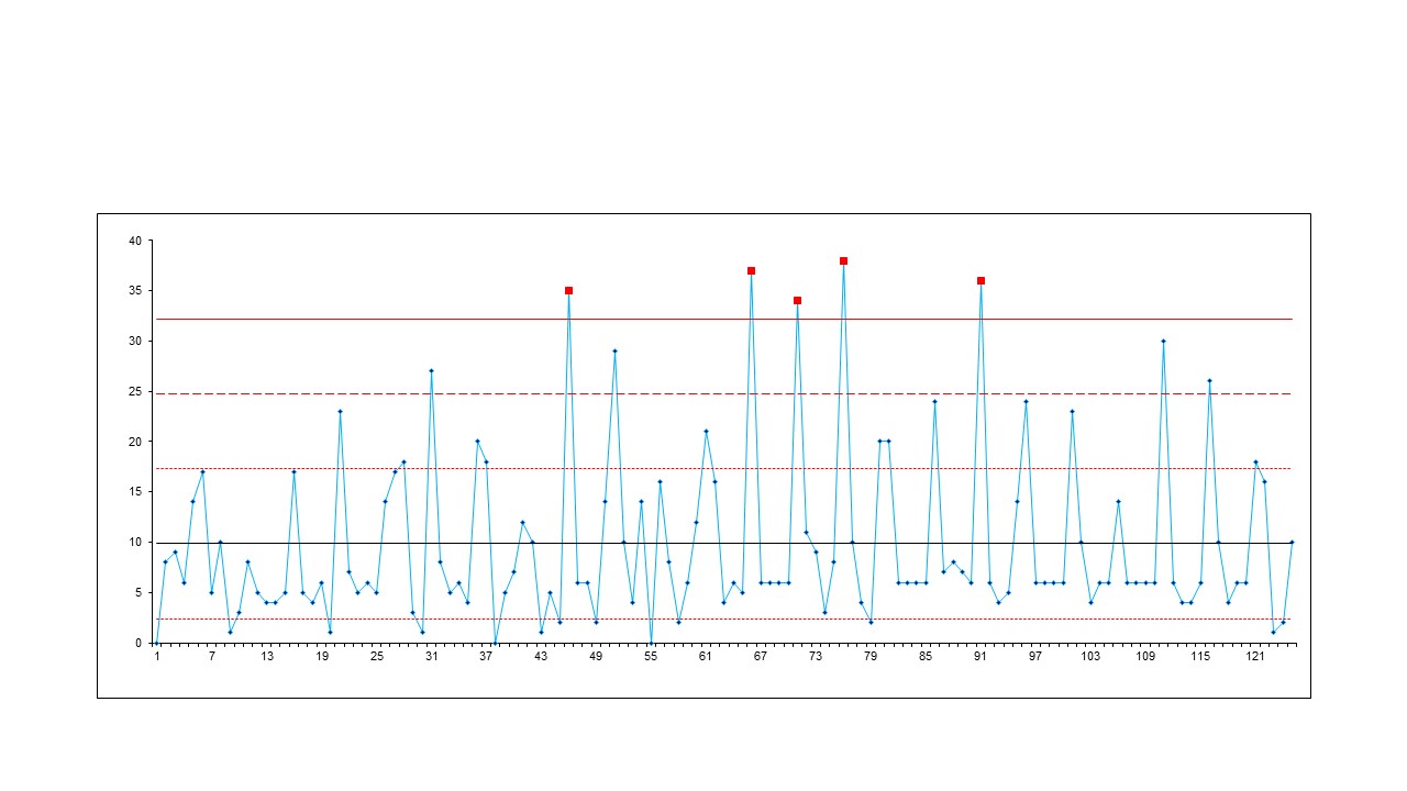
(click on image to enlarge)
The control chart above can be used to measure bugs per day over a period of 125 days. There’s nothing too fancy about the plotted XY points, simply on a given day (X), this many bugs were introduced (Y). The beauty in the control chart are the horizontal lines on the chart. For you math fans, we’re talking about standard deviation. For everyone else, let me simplify. You see, there’s an “acceptable” number of bugs that the business/team/stakeholders/whoever agrees upon. This is determined by the black line in the graph (10, in our case). In essence, we’re simply saying that we realize that being human, we’re prone to mistakes and, therefore, understand that bugs are inevitable. For us and given the experience of the team members, we’re okay with 10 bugs. The lower limit(s) is/are the red line under the black (3, in our case). The purpose of this line in a control chart for quality assurance is our goal. Again, we realize that we’re human; so, a goal of perfection is setting ourselves up for failure. However, we can get pretty darn close. On any given day, when the number new bugs introduced is between 3 and 10, we consider it a good day. Let’s take it one step further… If on a day we introduce less than 3 new bugs, the team is rewarded. For instance, the team can be rewarded by allowing them to leave work 1 hour early. If the team experiences a succession of multiple days in a row with less than 3 bugs, then the team is rewarded in a greater capacity (free lunch, etc.). Companies use the control chart for rewarding their team members. The upper limit(s) is/are the red line above the black (17, 25, 33). In software development, there’s usually at least 2 upper limits. The lowest, upper limit is very similar to the first lower limit - just the opposite direction. When bugs are between the base line and the first upper limit, we consider that not a very good day. Anything between the first upper limit and the second upper limit is considered high. Taking the above chart with a third upper limit into consideration, any day with bugs between the second and third upper limits is critical. Finally, if a certain day experiences anything above the third upper limit, then the team is stopped, regrouped and assessments are made as to what is happening in the process that needs to be adjusted (and quickly). In continuous delivery, on days that experience high or very high introductions of new bugs, releases are not deployed. If your team is running agile and your X axis is measuring sprints/iterations - not days - then typically a maintenance sprint/iteration is scheduled to reduce the number of bugs currently in the application. Keep in mind that, while the above chart only has 1 lower limit and 3 upper limits, your chart can have as many lower and upper limits as your team desires. Maybe the limits are a little more granular and thus the rewards are as such. It’s totally up to you. You can perhaps think of the control chart as a square dart board - the closer you get to the bottom (center) the better.
Sample Reports
- Ishikawa (“fishbone”) Diagram
- Check Sheet
- Stratification (alternatively, flowchart or run chart)
- Control Chart
- Histogram
- Pareto Chart
- Scatter Diagram