A stratification diagram, also known as a flowchart or run chart, is used to determine the relationship between two or more sets of data. Stratification diagrams are helpful for making patterns visible when data is coming from a wide variety of sources. These patterns can be compared to the various systems under test so that we can, once again, adjust our processes in order to improve quality. Let’s take our check sheet from the previous post. For this diagram, we want to measure an incremental deployment of our application to four different sites. So, based on how many new features are deployed to each site, we want to see the a comparison of how many total bugs each site experiences. (DISCLAIMER: The data below was generated using Excel’s RANDBETWEEN function and is not necessarily what would be typical in a true deployment scenario.) 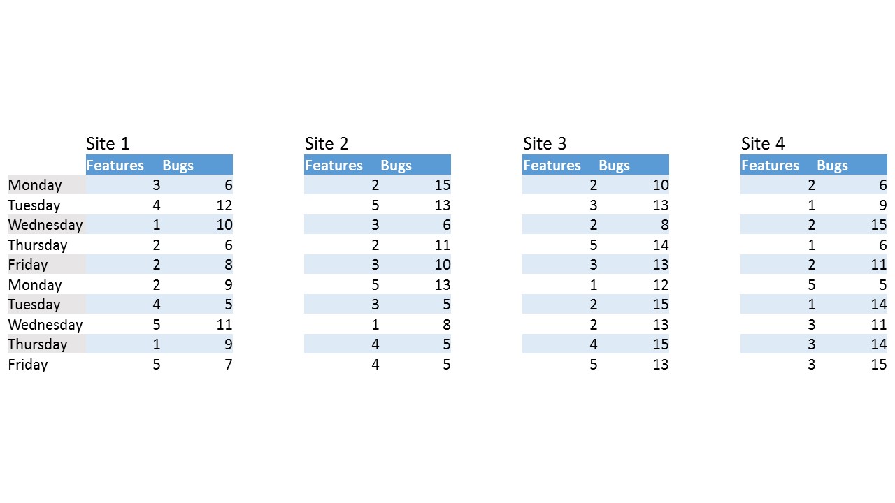
(click on image to enlarge)
The chart above would be something experienced in a agile continuous delivery cycle where every night a new version of the product is released into production. The above data would generate a stratification diagram like the following: 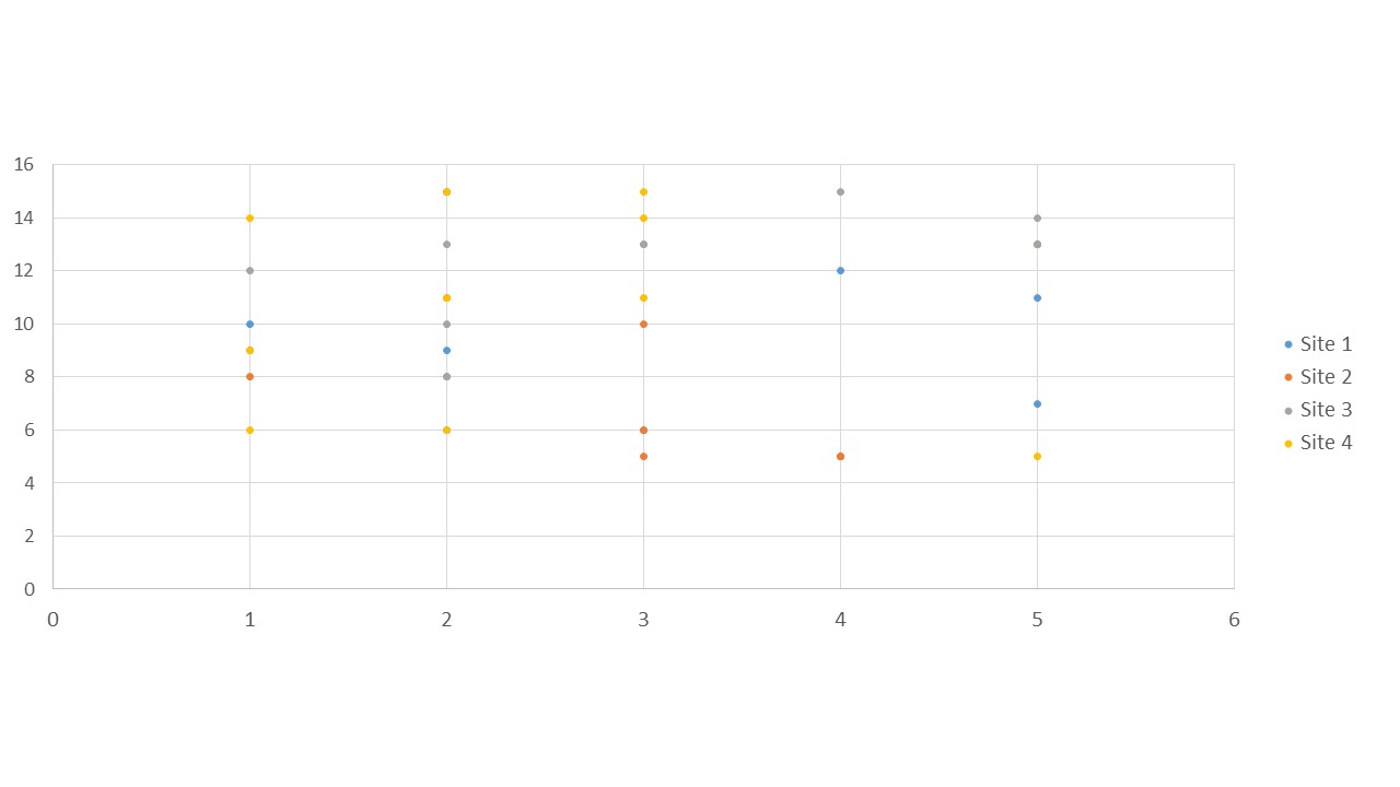
(click on image to enlarge)
So, let’s talk a little bit more about what’s going on. As briefly stated above, a stratification chart is a XY graph that uses multiple sets of data for the purpose of determining patterns. The X axis is typically what we’d consider the input, while the Y axis is what we’d consider the output. So, in this case, we are measuring the input of features vs. the output of bugs. “Bugs,” in this case, could be a very loose title. Bugs could include measuring user adoption and learning curves - the overall user’s experience with the new feature set. On average, across the 4 sites, we’ve introduced 28.25 features which has generated 101.5 bugs. Site 2 had the most features introduced but, was third in experiencing issues. And, if you look at the average feature to average bug ratio, Site 2 had a lower ratio (2.6:1) which means that it, on average, could handle even more features than what was implemented provided that QA and support teams had the capacity to handle incoming requests. At the opposite of the spectrum, Site 4 had a total of 23 features (averaged 2.3 per day), but experienced 106 bugs (10.6/day) giving us a average ratio of 4.61:1. Again, keep in mind that this could simply be user experience and, therefore, lack of training. But, in a larger capacity, the application being developed may have different business rules per site. We, then, see that Site 4 may require greater complexity in regards to business requirements; or, if there’s a different development team per site, the development team for Site 4 may need greater guidance and/or supervision. Regardless, QA efforts must be increased for Site 4 deployments. Let’s also examine the flow of features to bugs over a sprint. Site 1 was pretty average throughout the sprint. Site 2 had greater bugs at the beginning of the sprint, but seems to have tapered off towards the end. Site 2 looks to be an early adopter. Unfortunately, Site 3 struggled throughout the entire sprint, regardless of how many bugs were introduced. And, with Site 4, the bugs were experienced later in the sprint - they are possibly a late adopter. Keep in mind, you can always change the inputs and outputs. For example, the above table examines features to bugs. You could, however, have day of the week as your input and have features or bugs as your output to measure features per day or bugs per day, respectively. Then, the systems under test could be 4 different development teams. This way you could compare data across multiple teams to see which is/are the most efficient or which is/are the most prone to bugs, again, respectively.
Sample Reports
- Ishikawa (“fishbone”) Diagram
- Check Sheet
- Stratification (alternatively, flowchart or run chart)
- Control Chart
- Histogram
- Pareto Chart
- Scatter Diagram