A histogram is a very simple diagram and doesn’t take much time to create. It illustrates a data point in history in order to calculate the probability of something happening in the future. In general, if we notice a trend of a event or action happening in a specific period, we can plan for the same event or action in the future, given the same circumstances. Let’s look at a histogram of bugs per month over a given year. The X axis is the month of the year; the Y axis is number of bugs. 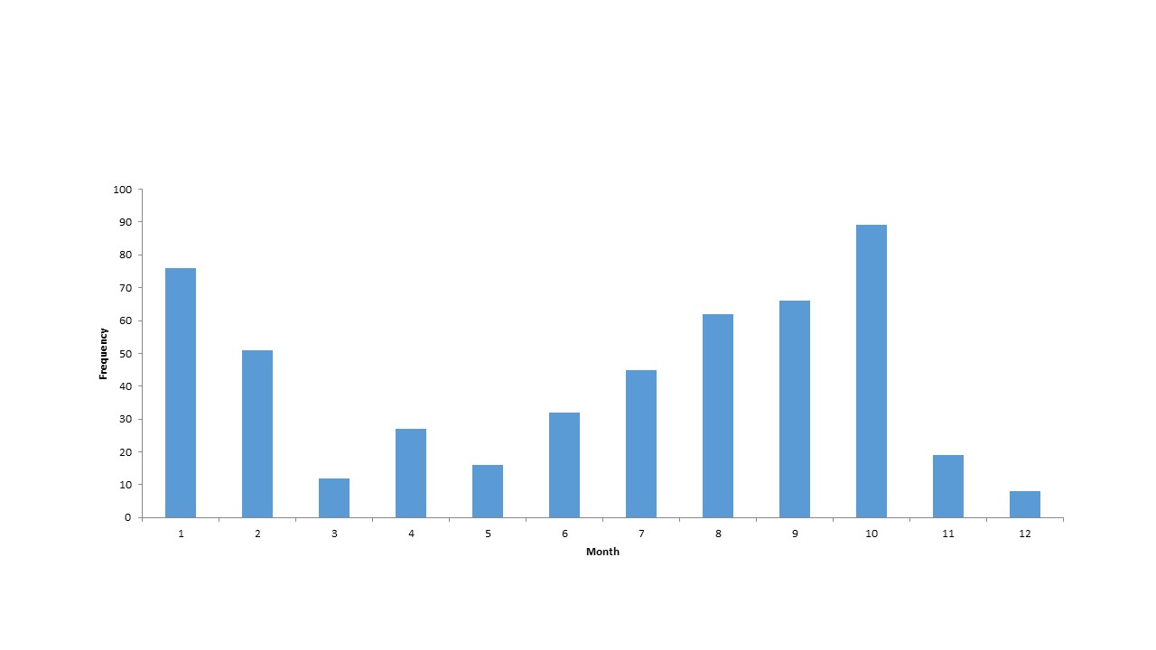
(click on image to enlarge)
By examining the histogram, we can see that January, February, and late-3rd to early-4th quarters are the heaviest in new bugs. For some companies and industries, this may make sense. For others, your timeline may be a little different. When I was a private contractor, I pretty much had two busy seasons - the first of the year and late-3rd/early-4th quarter due to either companies having a new budget and wanting to start on new initiatives; or, companies’ fiscal year ending and wanting to use as much discretionary funds as possible. Around early summer or during the holidays, most decision-makers are on vacation. In regards to quality assurance, the above histogram can help us in planning for bug resolution. It tells us when we need to increase our QA efforts. This may be in the form of human resource reallocation or, in the case above, hiring some temporary QA resources for 6-month contracts during May - October. Either way, at least we will be prepared in the future given the same production schedule.
Sample Reports
- Ishikawa (“fishbone”) Diagram
- Check Sheet
- Stratification (alternatively, flowchart or run chart)
- Control Chart
- Histogram
- Pareto Chart
- Scatter Diagram